Making a news platform's product suite more accessible via strategic mixed methods UX Research
651,520
average monthly visits to Newslaundry's website became more accessible due to our implemented research-backed product recommendations
Role + Team
UX Research Consultant
& Project Manager
UX Research Team
Collaboration with:
Engineering leadership, Director of Product & Revenue, Editorial leadership
,
Timeline
Late February - Early May
Process + Methods
User Interviews
Stakeholder Interviews
Comparative Market Analysis
Accessibility Audit
Heuristic Analysis
Survey Analysis
Usability Testing
,U
So, who is Newslaundry?
Newslaundry is an independent reader-supported lauded news and media platform based in India. They have a mobile app, mobile web, and desktop web platforms with article, video, and podcast content.
Newslaundry's product problem
Stakeholders at Newslaundry wanted to make their product suite more accessible for members of the Disability Community - to make news reachable for everyone. In doing so, they wanted to grow their reader and subscriber bases mixing social good with business goals.
Our Research Process:
Competitor Analysis across 9 competitors
5 User Interviews
Qualtrics Survey
Define pain-points disability community members face
Synthesize product opportunities and pitfalls
5 Usability Tests
5 Heuristic Analyses
Product Recommendations
Develop product-geared research and insights
Provide research-backed product reccomendations
How can we better understand users with disabilities?
To understand Newslaundry's target users we conducted 5 targeted user interviews with members of the disability community. We also attempted survey analysis to gain quantitative data on user's needs, goals, and common pain points.
User Recruitment

Ability Status:
Dyslexia, Total Blindness, Cataracts, ADHD
News & Media Interest:
Users who described themselves as
frequent or moderated digital news consumers
Research Practice
Semi-structured interviews to leave room for stories, insights, and user-based questions followed by insight coding and then streamlined themes.

Common User Pain Points


.jpg)
Qualtrics Survey
A Qaultrics survey was developed to gather quantitative insights into accessibility pain points and news consumption habits. We utilized a snowball recruitment style, but due to timing and a lack of connection to India-based news readers within the disability community, we could not gather enough responses with end-users for insights.


What do competitors offer this user group?
After identifying common pain points we wanted to contextualize market offerings and identify how Newslaundry stood and what product opportunities it could utilize.
We utilized secondary data to pinpoint Newslaundry's demographic then utilized thse user demographics and stakeholder interviews to analyze 8 competitors across content, features, and accessibility measures.
Outside of our benchmarking sheet, we conducted manual keyboard navigation and screen reader testing.


Identifying Newslaundry's product issues
After presenting common pain points and product opportunities within the market, we conducted 5 targeted Usability Tests to identify pain point-specific product recommendations.
User Recruitment
Ability Status:
Total Blindness, ADHD, Dyslexia, Limited Vision
News & Media Interest:
Users who described themselves as
frequent or moderated digital news consumers
Ages: 22 - 32
We targeted users 20 - 35 to match Newslaundry's core demographic
.jpg)
Research Practice
Structured Scripted Interviews:
We developed a script, interview protocol, and set note-taker & interviewer roles
Product Features:
Stakeholders reflected interest in podcast, accessibility settings, and subscription journeys and pages - as such we targeted these areas for testing
Translating research insights into design best practices to drive change
Alongside usability tests, we conducted 2 heuristic analyses, one accessibility focused and the other via Norman heuristics. We did this to define areas for best practice design solutions & to identify cross-over between best practice design heuristics and usability issues for hyper-targeted product fixes

Key Recommendations
We presented product-specific recommendations based on usability tests, heuristic analysis insights, user interviews, and comparative analysis research. Below are 3 selected recommendations
Notably, we also included code, podcast feature, and color contrast reccomendations
Dyslexia Mode
.jpg)

Visibility of System Status | Nielsen Norman
Problem:
When users toggle the Dsylexia mode the app automatically restarts | 4/5 Users Noted Issue
Recommendation:
Add a salient pop-up information box informing the user of the restarting of the application with an exit capability
Accessibility Settings
.jpg)

Error Prevention | Deque Systems | Accessibility
Problem:
Terminology and outcomes are not detailed throughout the Settings | 4/5 Users Noted Issue
Recommendation:
Provide written explanations via UI Cards and other intuitive elements to explain settings
Subscription Page
.jpg)

Problem:
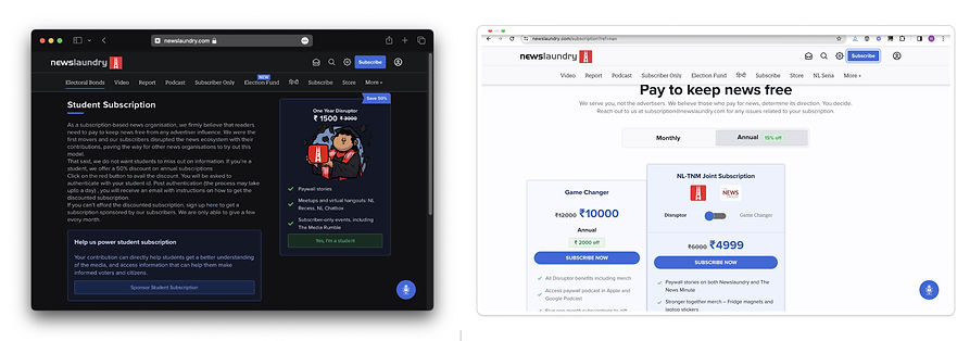
Subscription page is not screen reader accessible, and users described confusion on how to subscribe due to too much information and text boxes | 5/5 Users Noted Issue
Recommendation:
Establish a prominent subscribe button, streamline possible choices, and condense information, create a visual hierarchy
Impacting 600,000+ Monthly Visitors
Newslaundry implemented the majority of our recommendations, relaunched Newsable, their accessibility UX, and publicly shouted us out alongside their work with Google!

Dyslexia Mode
Based on our recommendation informed by Usability & Heuristic analyses Newslaundry provided a salient pop-up information box with clear exit capabilities
Before
After

Accessibility Settings
We recommended that Newslaundry provide clear visual explanations via UI Cards and decrease jargon to meet accessibility error prevention standards
Before
After
.jpg)
Subscription Page
Users struggled to subscribe to Newslaundry, so we advocated for prominent salient subscribe buttons, decreased text, streamlining the choice architecture and clear UI Card summarizations

Before
After